

How to Avoid 3 Costly DIY Website Mistakes
Designing your own website feels exciting at first—until you realize how many small decisions actually matter. Fonts, colors, layouts, spacing… everything seems simple in the beginning, and then suddenly you’re staring at your screen thinking:
“Why doesn’t this look the way I imagined?”
If that sounds familiar, you’re not alone. Most therapists, coaches, and small business owners start their online presence with good intentions and a basic plan:
“Create a website so people can find me.”
Simple, right?
But the truth is that a website isn’t just a place where information lives.
It’s someone’s first impression of you.
It’s their introduction to your work.
It’s what helps them decide if they feel safe with you or not.
And here’s something most DIY website builders don’t realize:
Small mistakes on your site can quietly push people away before they ever reach out.
Not because you’re doing anything “wrong,” but because no one teaches these things. And today, I want to fix that.
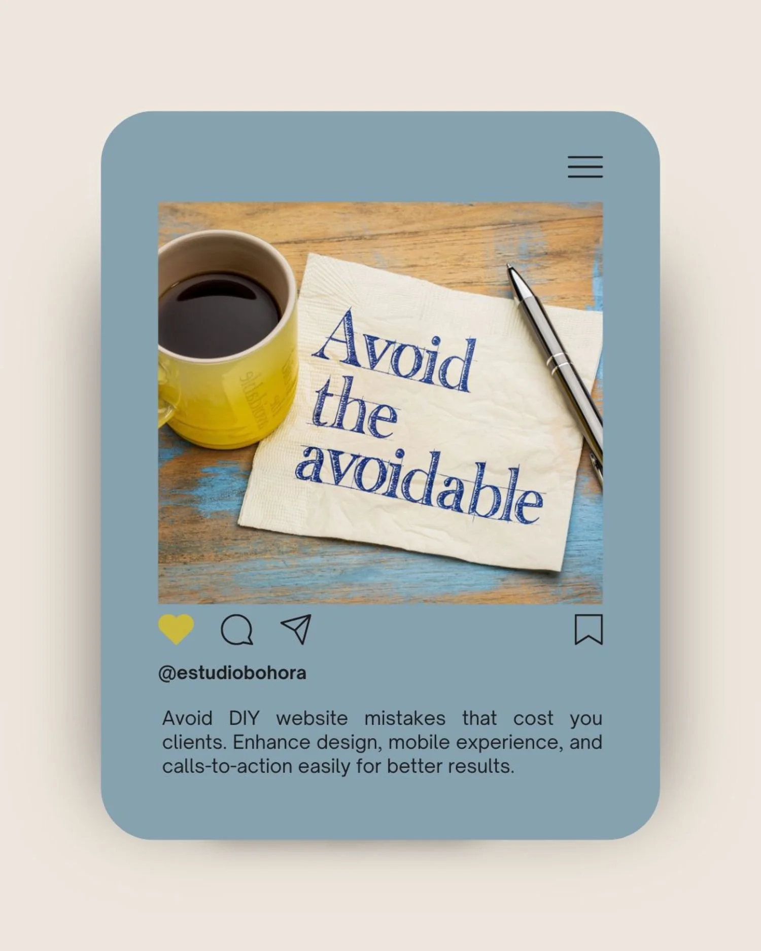
Here are the three DIY website mistakes that cost people the most clients—and how to avoid them with simple, easy changes.
Mistake #1: Visual Chaos (Too Many Fonts, Colors, and Random Elements)
This mistake happens more often than anything else.
You find a nice heading font… then a second one that feels “cleaner”… then a script font because it feels warmer. And since you’re already customizing things, you try a few different colors that look beautiful on their own but don’t really work together.
It all makes sense in the moment.
But to your visitor?
It feels confusing.
Why Visual Chaos Pushes People Away
Here’s what actually happens when someone lands on a visually busy page:
1. The brain gets overwhelmed.
Too many elements compete for attention—fonts, colors, shapes, icons, backgrounds. Even if it’s pretty, it becomes hard to look at. The visitor’s eyes don’t know where to focus.
2. It feels less professional.
People judge your website in 0.05 seconds.
That’s faster than you blink.
A cluttered design creates doubt—even if your work is excellent.
3. The site loads slower.
Every extra font, animation, and effect adds weight. If the page loads in more than three seconds, many people leave.
4. Nothing looks important.
When everything is emphasized, nothing actually stands out.
How to Fix It (Even If You’re Not a Designer)
1. Use 2–3 fonts total
One font for headings
One for body text
Optional: One accent font
That’s it. Professional sites follow this rule for a reason.
2. Choose a simple color palette (60–30–10 rule)
60%: your main neutral color (white, off-white, soft beige)
30%: your secondary color (your brand color)
10%: your accent (usually a button color)
Less color = more clarity.
3. Remove anything that doesn’t support the message
If it feels decorative, busy, or unnecessary—it probably is.
4. Think of your homepage as a calm space, not a collage
Your visitors should feel relaxed, not overstimulated.
If you’re unsure how to choose a layout that avoids these issues from the start, this guide walks you through what actually matters when selecting a Squarespace template.
Mistake #2: Ignoring Mobile (Where Most People Actually See Your Site)
This one is huge.
Most therapists and coaches don’t realize how many people visit their site on a phone. Here’s the truth:
More than 58% of all website traffic is mobile
For therapy and coaching sites, it’s closer to 65–70%
Google judges your mobile site more than your desktop site
If your website is hard to read or difficult to use on a phone, people leave—even if they genuinely need your help.
Signs Your Mobile Experience Isn’t Working
1. Tiny text
If someone needs to zoom in, they won’t stay long.
2. Buttons that are too small to tap
If a visitor has to try twice to click your call-to-action, that’s a problem.
3. Images that look squeezed or cut off
A beautiful desktop layout often looks messy on a phone.
4. Forms that are frustrating to fill out
Long forms, tiny fields, or confusing layouts will tank your conversions.
How to Fix Your Mobile Site Easily
1. Use body text at least 16–18px
Readable = trustworthy.
2. Make buttons large and easy to tap
At least 44px tall, with breathing room around them.
3. Stack columns vertically
Two or three side-by-side sections look great on desktop…
but cramped on phones.
4. Test your site on your actual phone
This one simple step instantly reveals what needs fixing.
5. Simplify the mobile menu
Fewer items → more clarity → better user experience.
If fixing your mobile layout feels complicated, our templates come fully optimized for phones and tablets. You won’t need to adjust columns, buttons, or spacing—everything is already responsive.
👉 Explore our mobile-ready website templates here
Mistake #3: Confusing or Missing Calls-to-Action (CTAs)
Your website exists for one main purpose:
to guide your visitors to the next step.
But here’s what happens on most DIY websites:
There’s no clear button telling people what to do
Or there are too many buttons competing for attention
Or the CTA is vague (“Learn More,” “Submit,” “Click Here”)
Or the CTA is buried at the bottom of the page
When someone is ready to reach out, your website should make it easy—not overwhelming or confusing.
If you’re unsure where to place your CTAs or how to word them, our website templates include built-in, strategic CTA sections that guide your visitors naturally toward booking a session or contacting you.
👉 Explore our conversion-focused Squarespace templates here
Why CTAs Matter More Than You Think
Visitors come to your site at different stages:
Cold visitors
Just found you, not ready to book.
They need a low-pressure next step.
Warm visitors
They already know a bit about you.
They want more details.
Hot visitors
They’re ready to book today.
They simply need the button.
One CTA cannot meet all three needs.
But you can place CTAs throughout your site in a smart way.
How to Fix Your CTAs
1. Put one clear CTA at the top
“Book Your Free Consultation”
“Schedule a Call”
“Start Here”
Simple. Direct. Helpful.
2. Repeat the CTA 2–3 times
People scroll. Don’t make them scroll back up.
3. Use clear wording
Tell people exactly what they’re doing.
4. Don’t overload the page
One main CTA per page → better conversions.
5. Use a contrasting accent color
Your CTA should stand out clearly—no guessing.
A Simple Checklist to Audit Your Website Right Now
Take a deep breath and pull up your homepage.
Now answer these honestly:
□ Can someone understand who you help in 5 seconds?
□ Am I using more than 3 fonts?
□ Does my site look busy or messy?
□ Is my text easy to read on mobile?
□ Are my buttons easy to tap?
□ Is there a clear CTA in the first section?
□ Do my images feel calm and consistent?
□ Does my site sound like me?
If you checked 2 or more, your site may be confusing visitors without you realizing it.
If you checked 3 or more, you likely need a refresh—or a layout that already solves these problems for you.
Your 30-Day Website Fix Plan
Week 1: Clean up your visual design
Pick 2–3 fonts
Simplify colors
Remove decorative clutter
Week 2: Fix your mobile experience
Increase text size
Make buttons clear
Stack columns
Test everything on your phone
Week 3: Improve your CTAs
Add a clear CTA at the top
Repeat it calmly throughout the page
Use a clear, action-based message
Week 4: Polish and review
Remove old or outdated content
Ask a friend to test your site
Make small adjustments based on feedback
Small improvements can create big results.
If You Want This Done Without the Stress…
You don’t need to rebuild your site from scratch.
You don’t need to fight with layouts or color palettes.
And you definitely don’t need to do this alone.
That’s why I created ready-to-use Squarespace templates built specifically for therapists, coaches, and wellness professionals.
Each template has:
✔ clean structure
✔ mobile-friendly layouts
✔ simple navigation
✔ clear CTAs
✔ space for storytelling
✔ a calm, professional aesthetic
You customize the words.
You add your photos.
And your website finally looks and feels the way you imagined.
Some therapists choose to start with a clean, ready-to-use layout that already avoids these common mistakes — offering clarity, calm, and structure from the beginning.
Explore calm Squarespace website templates designed for therapists & mental health professionals.