How to Structure a Therapist Website (A Squarespace Guide)
So your therapist website homepage has been live for two years now.
You've gotten compliments. People tell you it looks professional. But when you actually check your analytics? Something feels off.
People visit. They scroll. And then they just... leave.
No contact forms filled out. No consultation requests. Just silence.
Most of the time, the issue isn’t the design of the homepage itself.
It’s the structure of the page — and the order in which visitors encounter information. Or maybe it's more like this: you threw your homepage together when you were first starting out. You looked at what other therapists were doing, copied the basic structure—bio, credentials, stock photo. Done.
It works, sure. But you know it's not really helping anyone make a decision.
Here's the thing most therapists and psychologists miss:
Your homepage isn't a résumé. It's not your Psychology Today profile. And it's definitely not the place to dump everything you know about therapy.
Your homepage has one actual job:
help the right person feel safe enough, clear enough, and oriented enough to reach out.
That's it.
This guide walks you through how to build a homepage that does that—with real examples, practical sections, and design choices that make sense for both clients and clinicians.
This isn't about being trendy or doing marketing tricks. It's about structure that's ethical, language that's clear, and design that respects what someone's actually trying to figure out when they land on your site.
This post contains an affiliate link to SimplePractice. If you choose to sign up through this link, I may earn a small commission at no additional cost to you. I only recommend tools I genuinely trust and that support ethical, well-structured clinical practices.
Why Homepage Structure Matters More Than Ever
Most potential clients don't arrive at your website feeling confident and decisive.
They arrive uncertain, emotionally drained, and quietly evaluating risk.
They're asking themselves:
"Is this person safe?"
"Do they understand what I'm dealing with?"
"Will this process feel overwhelming?"
Your homepage doesn't need to convince them. It needs to regulate before it explains.
That's why structure matters more than copy alone.
The Problem With Most Therapist Homepages
Let me show you what usually happens:
A potential client Googles "anxiety therapist in San Juan." They click on your website. The hero section says "Compassionate Care for Your Mental Health Journey" over a stock photo of a couch.
They scroll down. There's your full bio—education, training, certifications. Then your theoretical orientation. Then a list of ten things you treat. Then insurance information mixed with scheduling details.
By the time they get to the contact form, they're exhausted. They're not sure if you're right for them. They open three more tabs to compare. They close everything. Adiós.
Two weeks later, they book with someone else.
This isn't because your copy was bad. It's because the structure asked them to do too much emotional work before they felt safe enough to decide.
What a Well-Structured Therapist Homepage Actually Does
When a homepage is structured well, something subtle but important happens.
Visitors don’t feel like they’re being “marketed to.”
They feel oriented.
Instead of scanning for credentials or trying to decode what you offer, the structure quietly answers the questions most potential clients are already asking:
Am I in the right place?
Does this therapist understand what I’m dealing with?
What happens if I reach out?
When these questions are answered in the right order, the homepage stops feeling like a marketing page and starts functioning like the front door to your practice.
The sections below follow a structure that supports that experience.
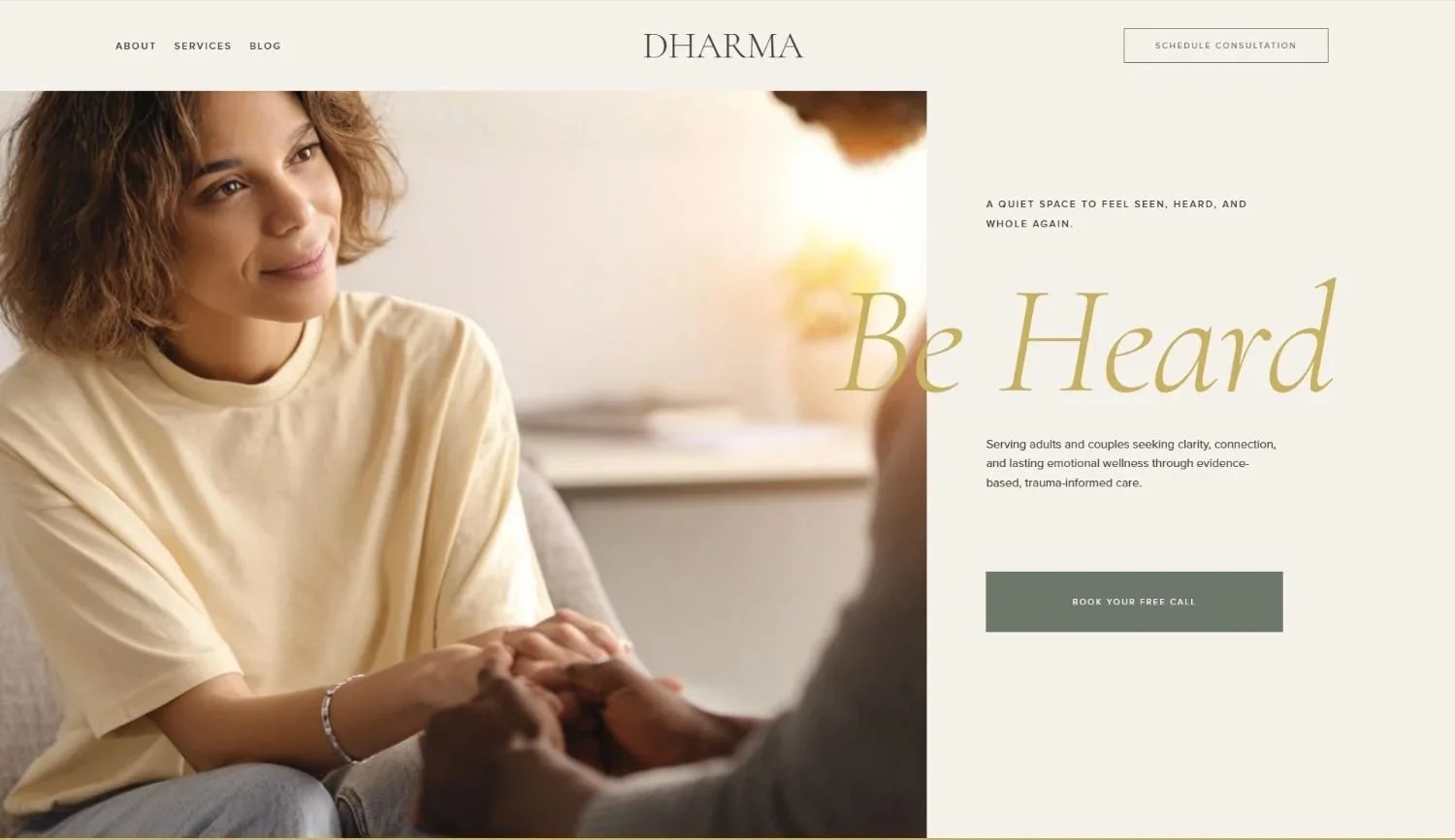
Section 1: The Hero Section—Calm Before Credentials
The hero section is the emotional front door of your practice.
Its job is orientation, not persuasion.
What this section must do:
Clearly communicate who you help
Signal safety and professionalism
Offer one clear next step
What to include:
A client-centered headline
A grounding subheading
One primary CTA
Example:
Therapy for adults navigating anxiety, burnout, and life transitions
Thoughtful, evidence-informed support—online and in person
[Request a Consultation]
What to avoid:
Credential stacking
Sliders or carousels
Abstract mission statements
If your hero section feels busy, your visitor's nervous system feels it immediately.
How This Structure Looks in Practice
Understanding the theory is helpful.
Seeing how it works in a real homepage is even better.
Many therapist websites struggle not because the therapist lacks clarity, but because translating structure into design decisions can be difficult.
This is exactly why therapist-specific website templates exist.
Templates like Dharma and Serene are built around this type of homepage flow—prioritizing emotional safety, clear orientation, and calm visual hierarchy.
Instead of starting with a blank page, the structure is already embedded into the layout.
That way therapists can focus on their message and their practice rather than second-guessing every design decision.
Clearly communicate who you help
Signal safety and professionalism
Offer one clear next step
Section 2: "Who This Is For" (Before "About Me")
Here's one of the most common structural mistakes therapists make: leading with their biography.
Strategically and psychologically, that's backwards.
Before a visitor wants to know who you are, they need to know: "Is this for someone like me?"
Purpose of this section:
Help clients self-identify
Reduce misaligned inquiries
Create recognition without diagnosis
Example structure:
You may be in the right place if:
You feel overwhelmed but high-functioning
You've been holding things together for a long time
You're looking for therapy that feels structured, calm, and collaborative
This kind of section lets visitors see themselves without pressure or labels. It answers their first question: "Is this relevant to me?"
Real scenario:
Someone lands on your homepage after months of searching. They read "You feel overwhelmed but high-functioning" and think: Oh. That's exactly it. That recognition—that moment of being seen—is what keeps them reading.
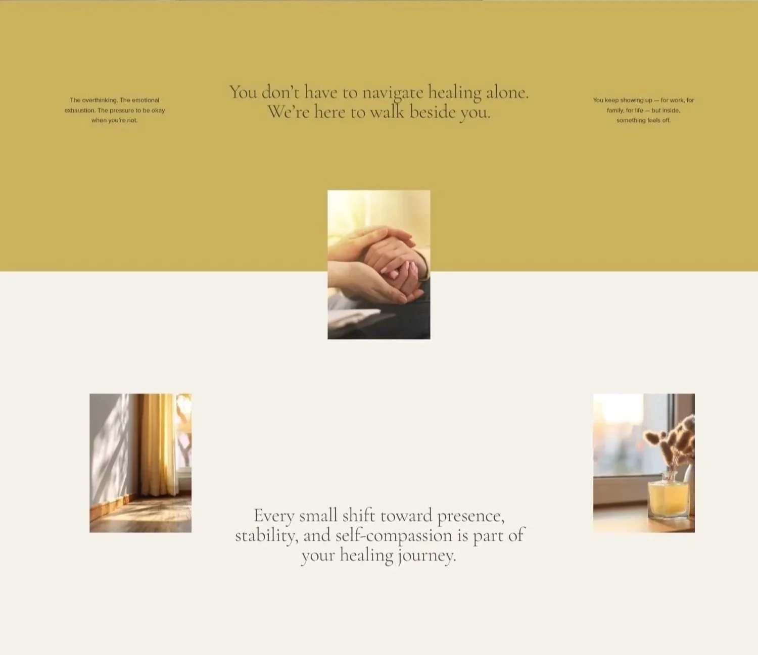
Who is this for section. Dharma Template
Section 3: Your Approach—How It Feels to Work With You
Your homepage is not the place for a theoretical essay.
Clients want to understand:
How sessions feel
How you work together
What makes your approach different in practice
Keep this section human and grounded:
"My work is collaborative, paced, and grounded in evidence-based care. Sessions balance reflection with practical tools, always moving at a pace that feels respectful and supportive."
This isn't about listing modalities. It's about helping someone imagine what it would actually be like to sit across from you (or on a video call with you).
Design note: In templates like Serene, this section often pairs with softer imagery and warmer tones, making it especially effective for therapists whose work leans toward holistic, integrative, or mind-body approaches.
Section 4: Services—Clear, Limited, and Scannable
Your homepage should preview, not catalogue.
Best practice for 2026:
Limit to 3–5 services
Use plain language
Avoid long explanations
Example:
Individual Therapy (Adults)
Anxiety & Stress Support
Burnout & Work-Related Concerns
Life Transitions
That's it. If someone needs more detail, they'll click through to a dedicated services page.
Keep this section simple—no dropdowns, no insurance explanations, no competing CTAs.
Your homepage isn’t just a marketing page—it’s the front-facing layer of your clinical system.
It’s where structure meets care.
When a homepage is thoughtfully designed—clear sections, predictable flow, and intentional pathways—it reduces uncertainty before the first session ever begins. Clients don’t have to work harder to understand what happens next. And therapists don’t have to carry that explanation repeatedly through emails, calls, or intake conversations.
This is why homepage structure isn’t a branding decision. It’s a clinical one.
Before choosing tools or templates, clarity comes first.
Many therapists try to solve overwhelm by adding platforms or redesigning aesthetics—without ever clarifying how their homepage is meant to work.
If you want your website to support calm instead of adding friction, this simple homepage checklist helps you pause, organize, and design with intention—before making any decisions.
Download the Therapist Homepage Checklist
Section 5: Online Scheduling—Automation Without Pressure
This is where many therapist websites either overdo it—or hide it entirely.
In 2026, clients expect scheduling to be simple, but they don't want it to feel transactional.
That's why online scheduling does belong on the homepage—just not at the top.
Ideal placement:
After trust is established:
Hero
Who this is for
Your approach
Services
👉 Online Scheduling (micro-section)
Contact / Invitation
How to frame it:
Automation should be communicated as ease and clarity, not efficiency.
Example:
Getting Started Is Simple
Scheduling is handled online to reduce back-and-forth and keep the process clear. Choose a time that works for you and receive automatic confirmations and reminders.
[Schedule a Consultation]
The system behind the scheduling matters.
For therapists, online booking isn’t just about convenience—it’s about safety, clarity, and continuity of care.
This is why many therapists using Squarespace integrate scheduling through SimplePractice. Not as a marketing feature, but as part of their clinical infrastructure.
When booking, intake forms, consent documents, and communication live in the same system, clients experience a smoother transition from “considering therapy” to “beginning care”—without unnecessary friction or back-and-forth.
Section 6: Practical Details Without Breaking the Mood
Logistics matter—but they shouldn't derail the emotional flow of the page.
Include calmly:
Location or service area
Licensure states
Session format (online, in person, hybrid)
In well-structured templates, these details live in quieter sections—often in the footer or a discreet sidebar—that support clarity without demanding attention.
Section 7: The Contact Section—Invitation, Not Sales Pitch
By this point, the visitor should feel oriented and grounded.
Your job here is simple: open the door gently.
Example:
"If you're wondering whether this might be a good fit, you're welcome to reach out."
[Request a Consultation]
Short forms, clear language, and predictable next steps matter more than clever copy.
Section 8: Optional Sections That Add Authority (Without Pressure)
Depending on your practice, you may also include:
Blog or resources preview
Signals thoughtfulness and authority
Supports long-term SEO
Helps clients understand how you think
Testimonials (when appropriate)
Used sparingly
Never above the fold
Always ethical and optional
Design note: Serene works particularly well for therapists who want to integrate reflective writing or wellness resources into their homepage without overwhelming it.

What a Therapist Homepage Should Not Try to Do
Let's be explicit.
Your homepage should not:
Educate clients on therapy theory
Replace a directory profile
Rank for every keyword
Convince everyone
Its role is orientation and trust, not persuasion through volume.
Why Squarespace Supports This Structure Well
Squarespace works especially well for therapists because it:
Encourages visual restraint
Handles forms, scheduling, and SEO cleanly
Supports calm, editorial-style layouts
Doesn't require coding or constant updates
But the platform itself is secondary to how intentionally you structure the page.
Templates like Dharma and Serene work because they respect attention, emotional load, and professional boundaries. They're built with the understanding that therapy websites serve a different purpose than e-commerce sites or corporate pages.
If You're Starting From Scratch (Or Starting Over)
If you're looking at your current homepage and realizing it's not structured this way—don't panic.
You don't need to rebuild everything. You need clarity on what each section should accomplish and a design foundation that supports it.
That's where starting with a thoughtfully designed template can save you months of trial and error.
Our Squarespace templates—Dharma and Serene—are specifically built for therapists and wellness professionals.
Not generic.
Not corporate.
Just clean, trustworthy structure that answers the questions your clients are actually asking.
You can customize them to fit your voice and practice, without the overwhelm of designing from scratch or second-guessing every layout decision.
Therapist Website Templates That Already Follow This Structure
If you're planning to build your therapist website on Squarespace, starting with a structure like this can save significant time and uncertainty.
Instead of designing every section from scratch, templates provide a foundation already aligned with how therapy websites need to function.
Two examples built specifically for therapists and wellness professionals are Dharma and Serene.
Dharma — Minimal, structured, and calm
Dharma is designed for therapists who want a clean and grounded online presence.
It works particularly well for:
• Individual therapy practices
• Evidence-based clinicians
• Professionals who prefer minimal, editorial design
The layout prioritizes clarity, spacing, and simple navigation so visitors can orient themselves quickly.
Serene — Softer and wellness-oriented
Serene was designed for therapists and wellness practitioners whose work leans toward integrative or holistic approaches.
It features:
• Warmer visual tone
• Flexible sections for resources or writing
• A slightly more expressive design while maintaining clinical professionalism
Both templates follow the homepage structure outlined in this guide.
They simply remove the guesswork from building it.
Final Thought: Structure Is Ethical
A well-structured homepage isn't a marketing trick.
It's an extension of good clinical judgment.
When your homepage is calm, clear, and intentional, it reduces uncertainty before the first session ever begins. Clients feel safer. Inquiries are better aligned. And the work becomes more sustainable for everyone involved.
When your homepage holds trust with the same care as your clinical work, structure stops feeling like marketing—and starts feeling like support.
If you're building your therapist website on Squarespace and want a foundation that already follows this structure, you can explore the Dharma and Serene therapist website templates.
They’re designed specifically for therapists who want a calm, ethical, and thoughtfully structured online presence—without starting from a blank page.